
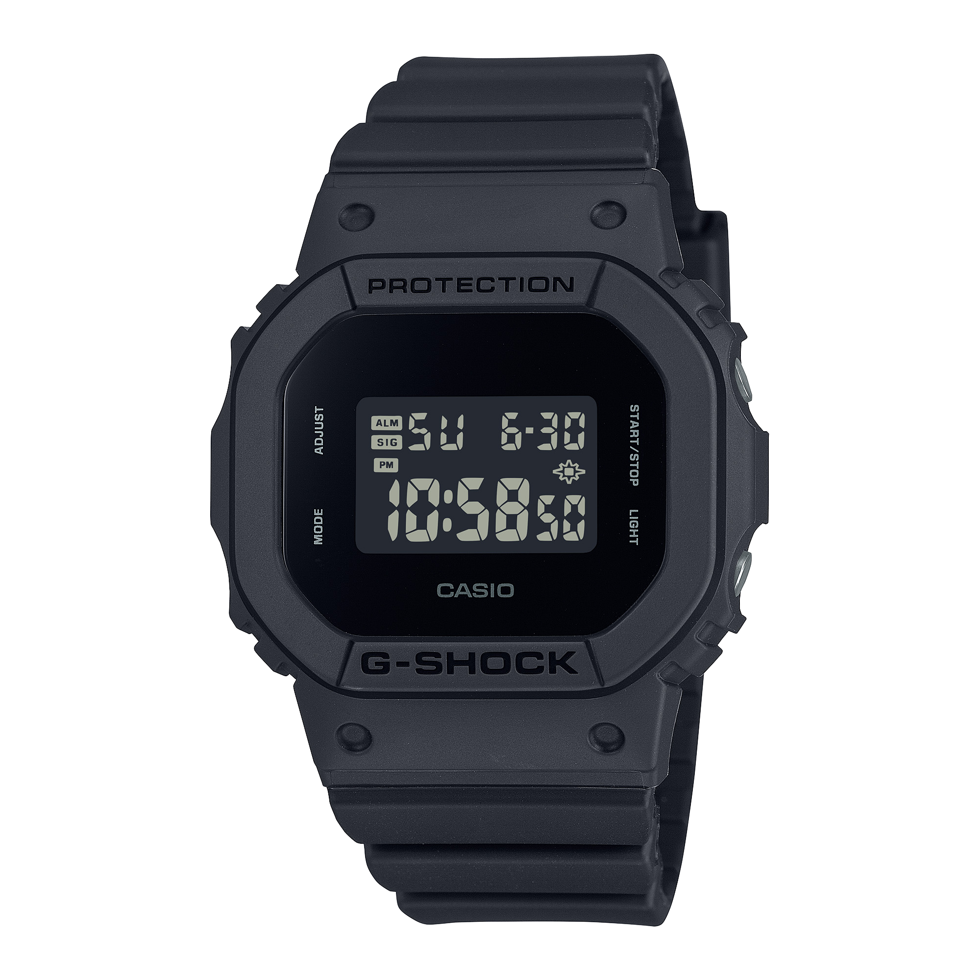


G-SHOCK GMW-B5000PB
As featured on Hodinkee


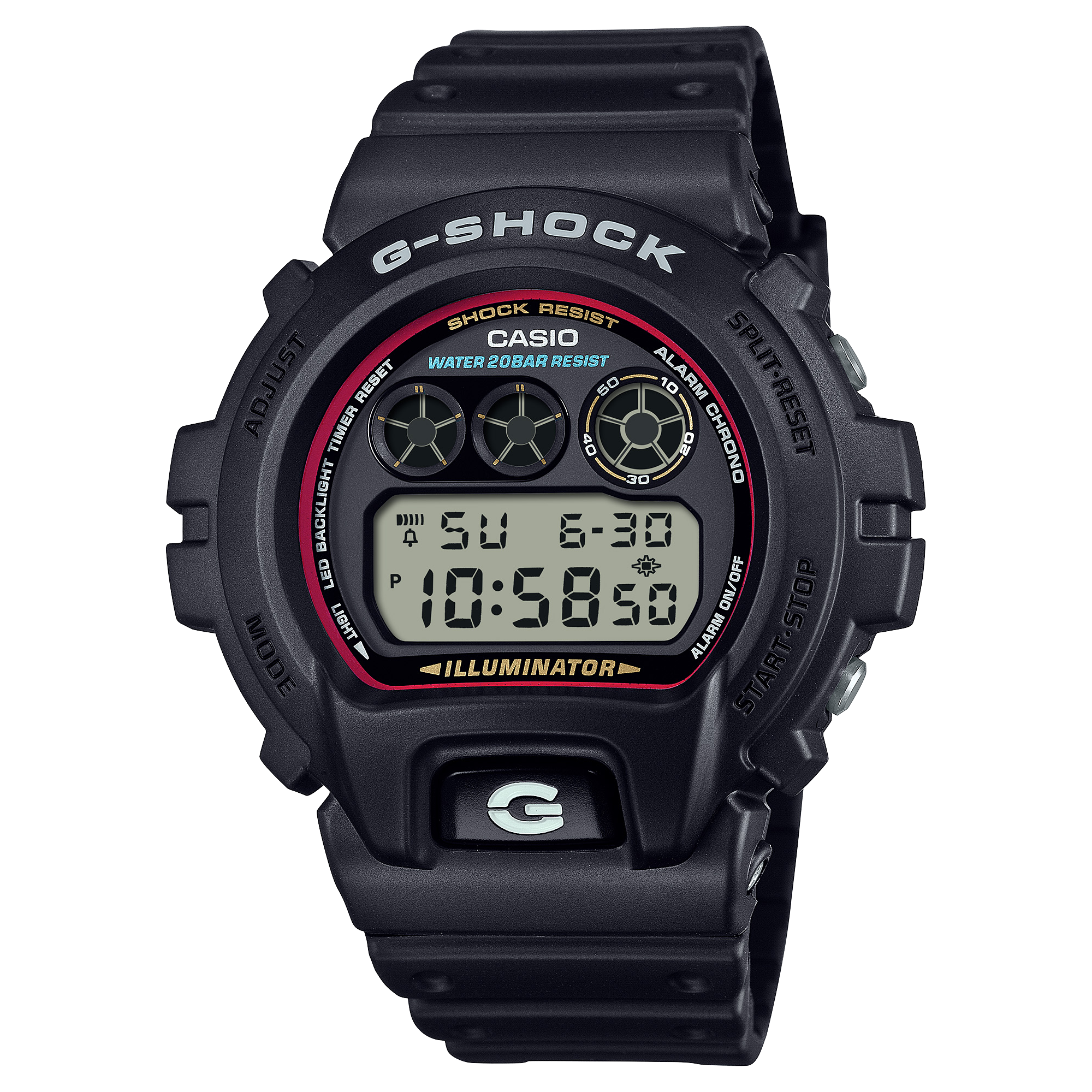
Since its debut in 1983, G-SHOCK has gained great popularity for its main feature, shock resistance. In the 1990s, G-SHOCK began to offer a wide range of designs and color variations, and it became known as a fashion icon. The unique and rich color variations were not limited to the standard G-SHOCK resin case, but also extended to metal models. IP (Ion Plating) processing has become an indispensable technology for applying various colors to this metal material.

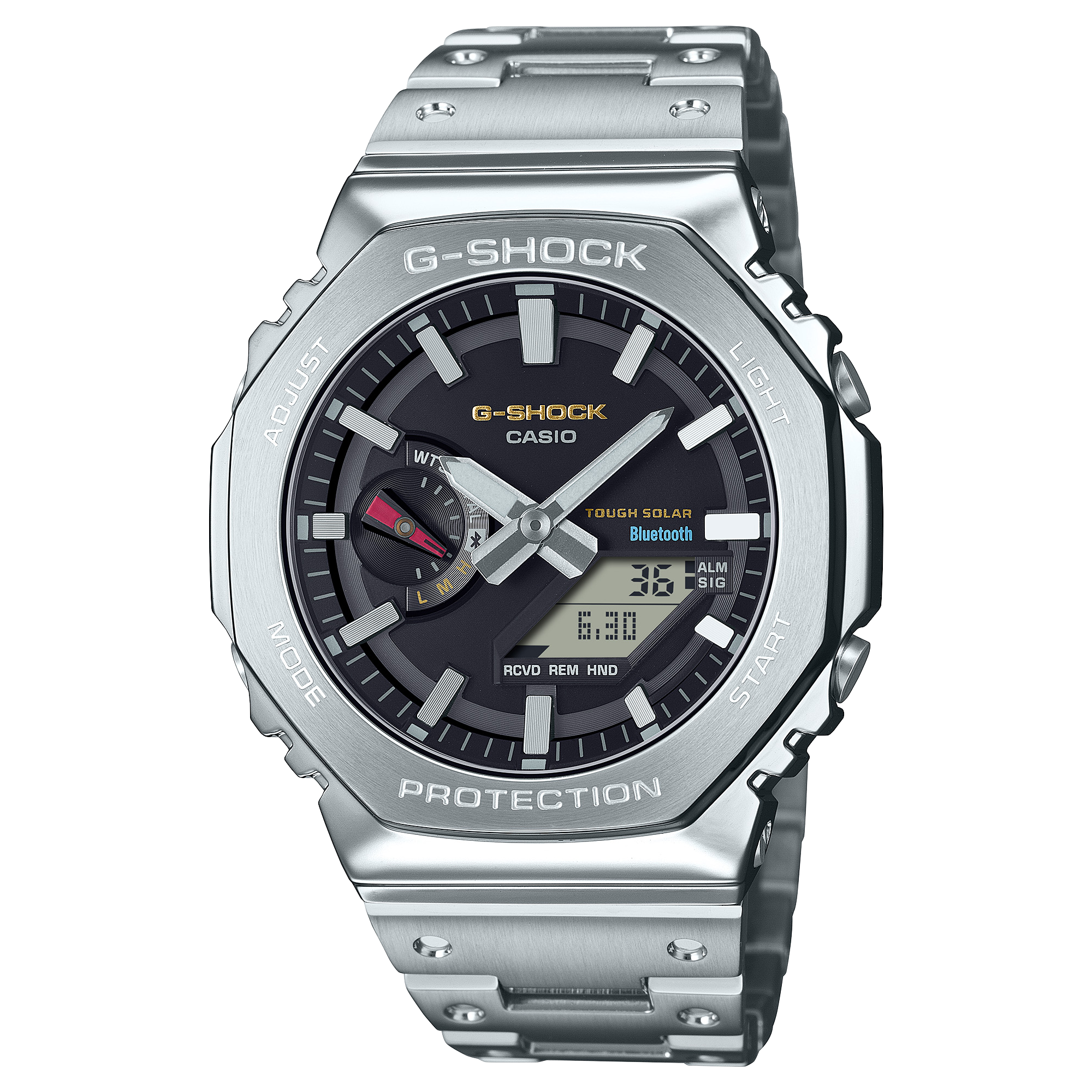
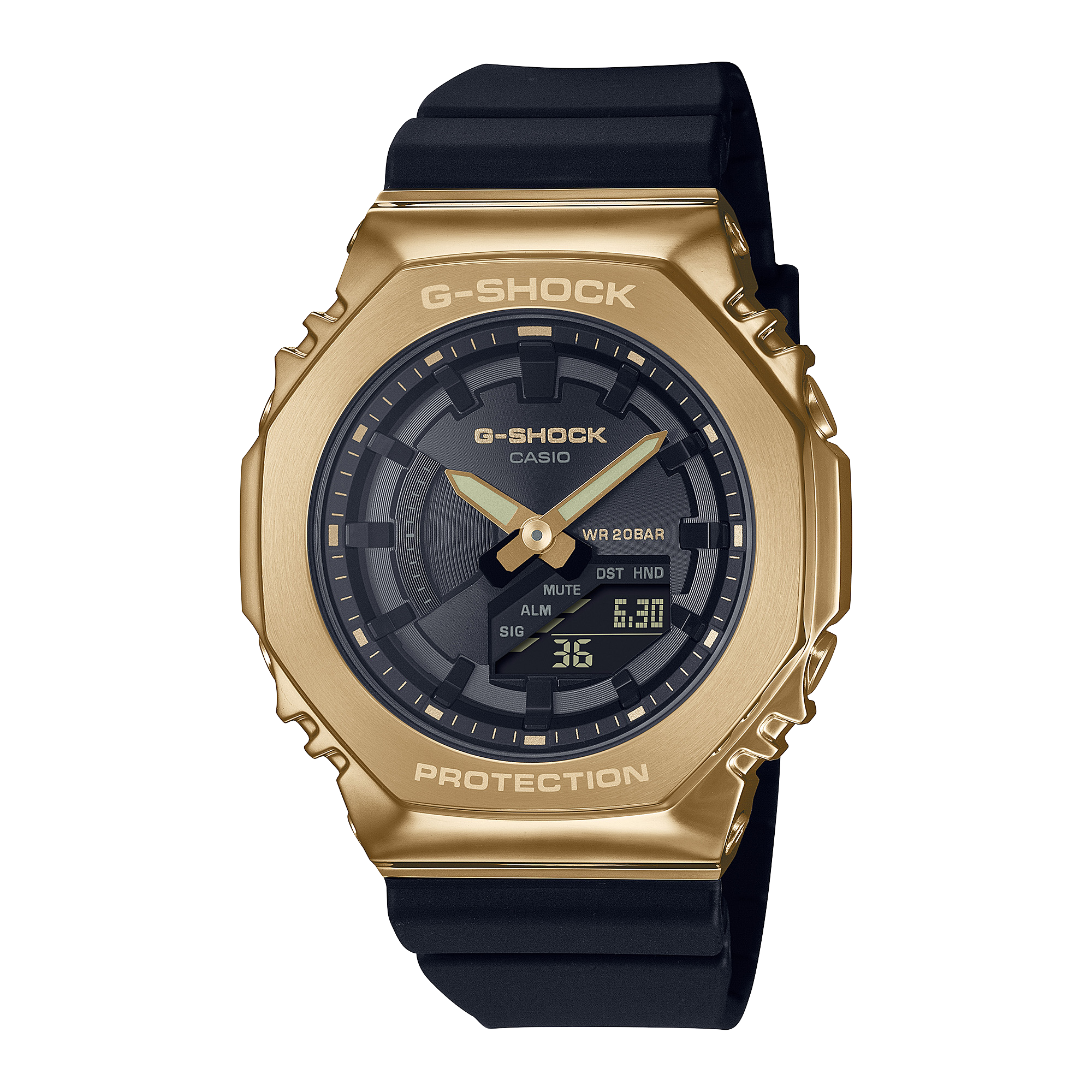
IP is a processing method for coloring by ionizing metal in a vacuum and depositing a thin film on the surface of the object, and is one of the key technologies used to create the colors used in the CMF (Color Material Finish) designs that Casio has been promoting in recent years. This is particularly evident in the GMW-B5000 series, which is based on the G-SHOCK ORIGIN and has a full-metal exterior. While the B5000D, which uses stainless steel for the case and band, is the starting point, the series has since been expanded to include black, red, blue, and other IP finishes. To top it all off, in April 2021, Casio released the GMW-B5000TR, with each piece of the band having a different color IP.


You may not yet have had the chance to visit Shinjuku, Tokyo’s famous “neon neighborhood”, but you’ve seen it. Countless times. Shinjuku is hinted at in the futuristic landscape of Los Angeles in Ridley Scott’s 1982 film Blade Runner, and, arguably, its most recent and iconic appearance was in Sophia Coppola’s 2003 film Lost in Translation. The area’s distinct ambiance perfectly details how neon signage and advertising that would come off as overkill in the West presents an undeniably artful and iconic visual symbol in Japan. The GMW-B5000PB, which features a new purple IP color, combined with the blue-gray IP color used also in the GMW-B5000TR, evoked a scene of Tokyo at twilight, and earned the watch the nickname of “Twilight Tokyo”.

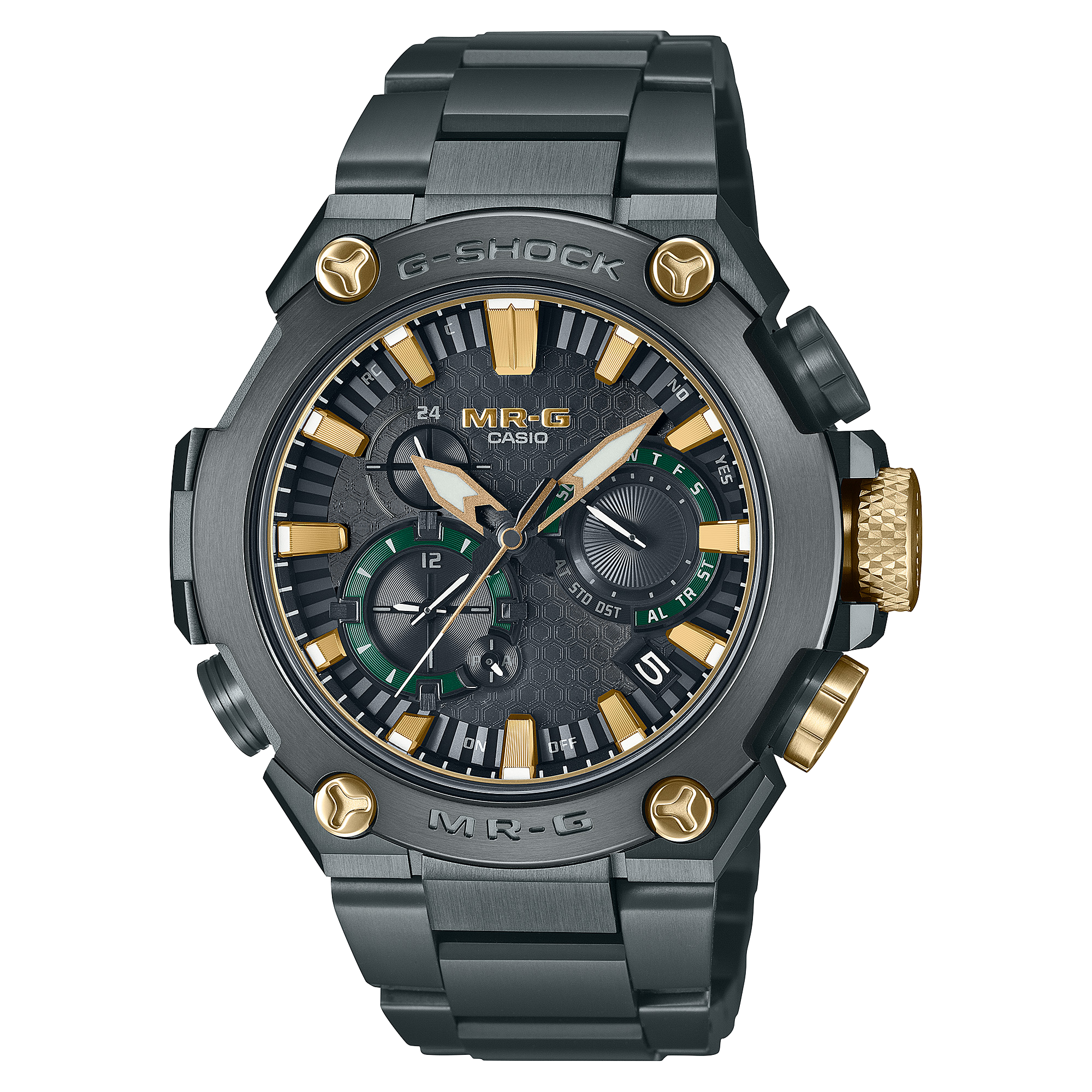
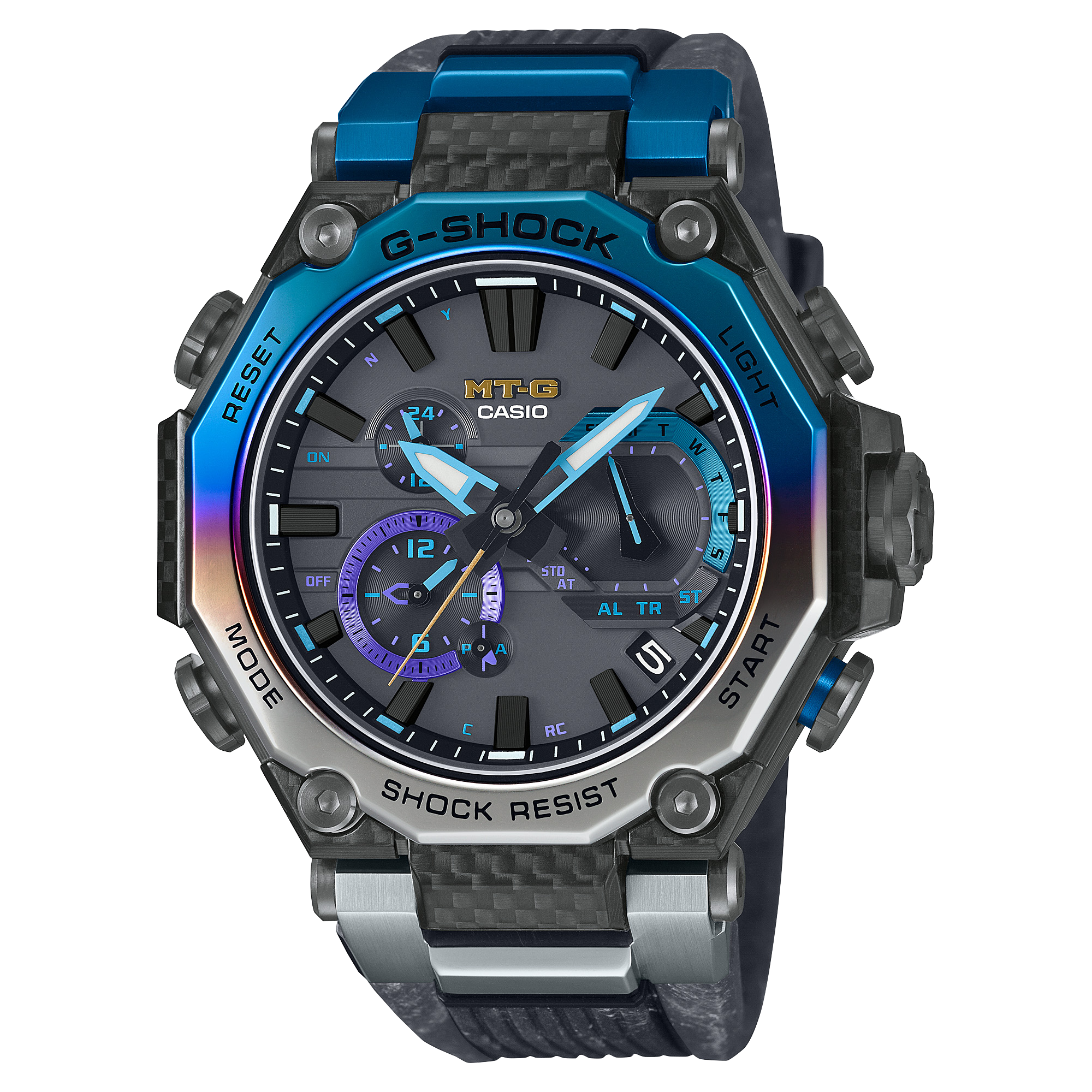
Casio has been using IP processing not only for basic G-SHOCK watches, but also for MT-G, Oceanus, and many others. Since then, Casio has been developing IP and DLC (diamond-like carbon) coating technologies to decorate the surface of its metal models, but it is particularly important that these technologies meet G-SHOCK 's quality standards. As G-SHOCK is known for its toughness, it is not only impossible to use processes that peel off easily, such as ordinary plating, but even IP processing, which is considered to have high adhesion, is subject to strict standards depending on the color, and color IP with a thin film that peels off easily will not be used for G-SHOCK. In other words, even if a good color is perfected, it cannot be commercialized if it does not meet the standards, so developing a new color that meets G-SHOCK standards is a constant challenge.


The colored metal components are mirror-finished, but also employ a degree of artistic restraint in a chromatic ode that would have been all to expected to render in a more neon-forward technique. But that restraint only serves to enhance the GMW-B5000PB-6’s charm. Dark blue case buttons and a reversed light-on-dark LCD screen with complementary pops of color seals the deal on this modern interpretation of a classic G-Shock footprint. The idea for the Purple IP began roughly four years ago, but took much trial and error to achieve the ideal tone since blue colors, including purple, are susceptible to color swings due to slight differences in processing conditions. With the GMW-B5000PB, the color has finally seen the light of day.

At first glance, the combination of purple and blue-gray may look avant-garde and typical of G-SHOCK, but when placed on the wrist, it is not only playful but quite handsome. Above all, the bicolor and brightly colored IPs give us even more reason to look forward to the development of the GMW-B5000 series and other metal G-SHOCK.
All content including images is credited to Hodinkee.